CUSTOM SHOWCASE: BOLD CONTRAST
“Combine the extremes, and you will have the true center.”
As in all forms of art, memorable lighting design frequently makes bold use of contrast. Much of the custom work we create in collaboration with our design clientele explores the power of contrast in material, texture, color, form, scale and space. It’s interesting to note that many recent custom designs coming out of our ‘shop’ have focused on the study of contrast relative to one particular color: gold.
Along with other metallics, gold tones — ranging from true gold to brass to amber — are increasingly becoming used as neutrals rather than accents. Pairing gold tones with other neutrals like black or white provides a visually compelling, high contrast combination that creates drama and edge. Black, especially matte black, is increasingly deployed as a super sleek, moody color that can command a leading role in spaces well beyond the ‘statement’ powder room.
GOLD & BLACK: BOLD, EDGY, SOPHISTICATED
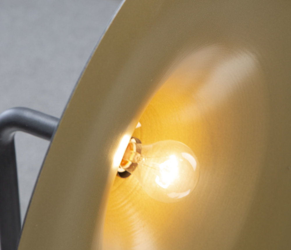
Pairing black and gold in lighting design results in an aesthetic that is rich and warm, yet bold and modern. Adding a layer of gold, whether it’s in the color of a glass shade or the finish on the underside of a fixture, packs a striking impact. Together, black and gold can also look refined and timeless with its effortless ability to set a sophisticated mood. The design versatility of this color combination easily explains its increasing popularity.
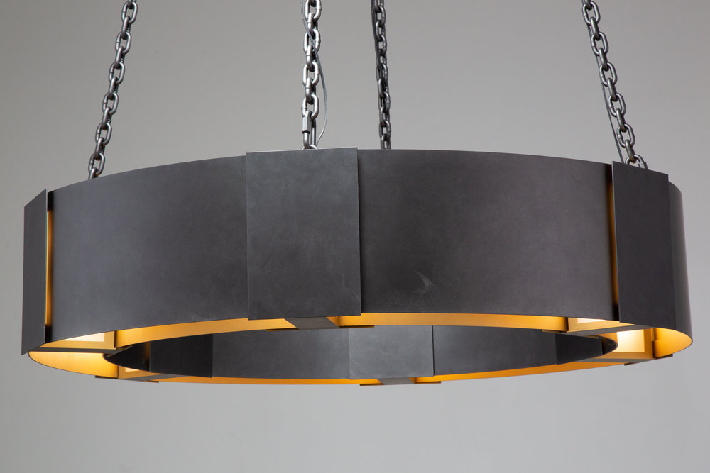
Above & below: striking contrast between a matte black exterior and an LED-illuminated gold interior brings an edgy modern mood to this traditional drum style. Fixture: DCH-2-001-17A-A
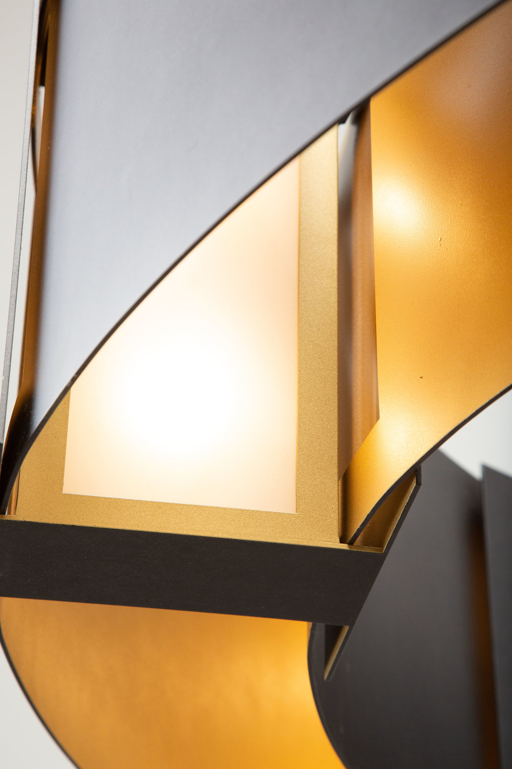
Above & below: a gold interior finish updates the look of this traditional barn light fixture style. Several of these 24”D sconces were commissioned for a large hospitality project at the Yellowstone Club..
GOLD & WHITE: REFINED, GLAMOROUS, CLASSIC
This classic color combination evokes the ultimate in luxury and glamour. Whether it’s a modern, contemporary, or a traditional interior design style, a contrasting gold and white color palette sets an upscale, sophisticated tone.
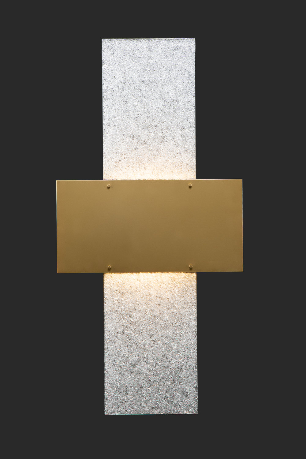
Four feet in height, the statement wall sconce shown above pairs a gold-toned finish with sparking panels of our Rimelight frosted kiln fused glass. Several of this design were commissioned for a large Miami oceanfront condominium complex.
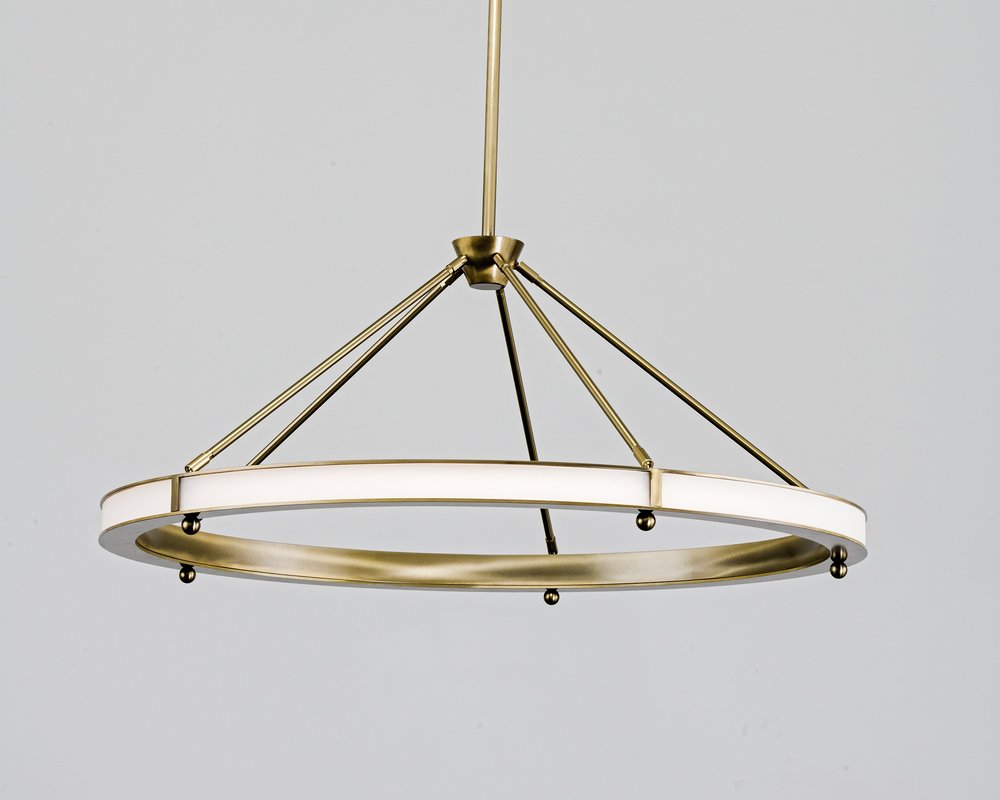
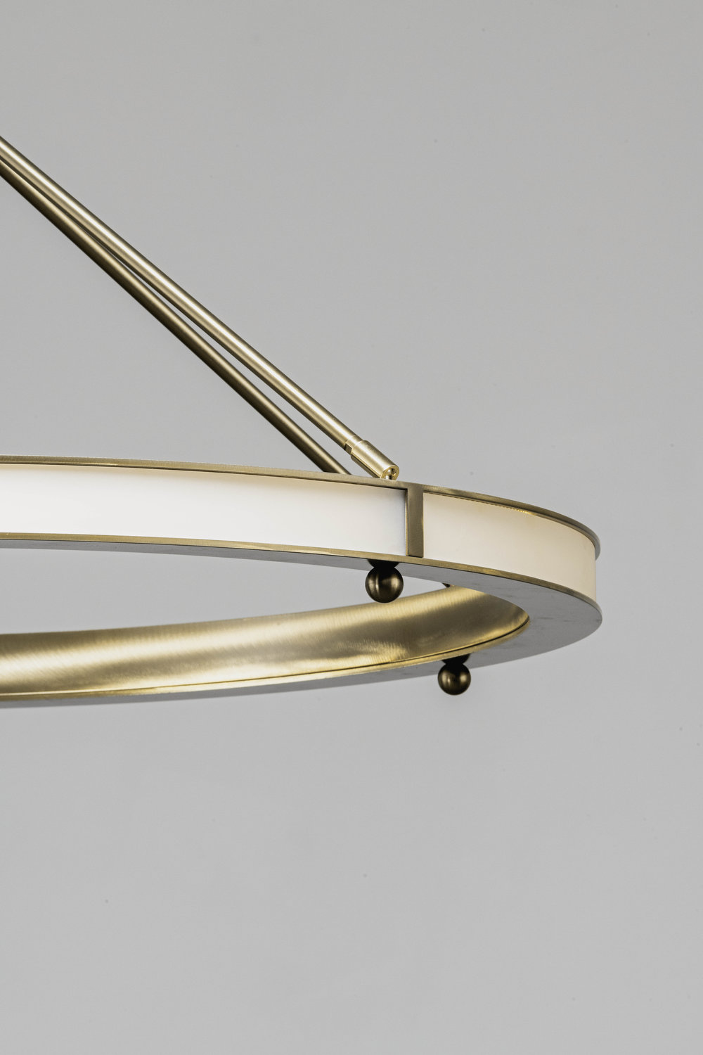
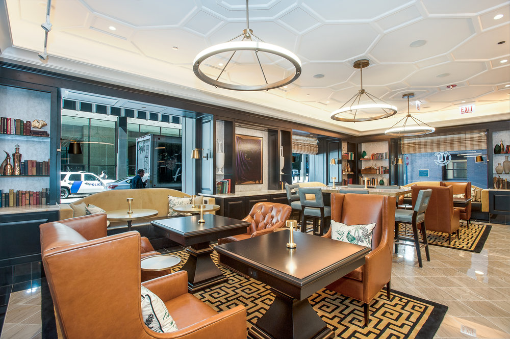
Above & below: A gold and white palette underscores elements of traditional and modern style in this sleek 42”D ring chandelier, designed in hand-polished steel and glass. A trio of these fixtures were recently installed in the newly renovated “One” business lounge at the historic Union League Club of Chicago.
CONTRAST COUNTERPOINT: MATERIALS & TEXTURE
Deploying different materials and textures to convey a contrasting palette adds an additional element of design intrigue. For example, take a look at the chandelier below. You’ll notice that the clean-lined geometries juxtaposing smooth art glass and steel intentionally create a harmonious balance between the black and gold tones
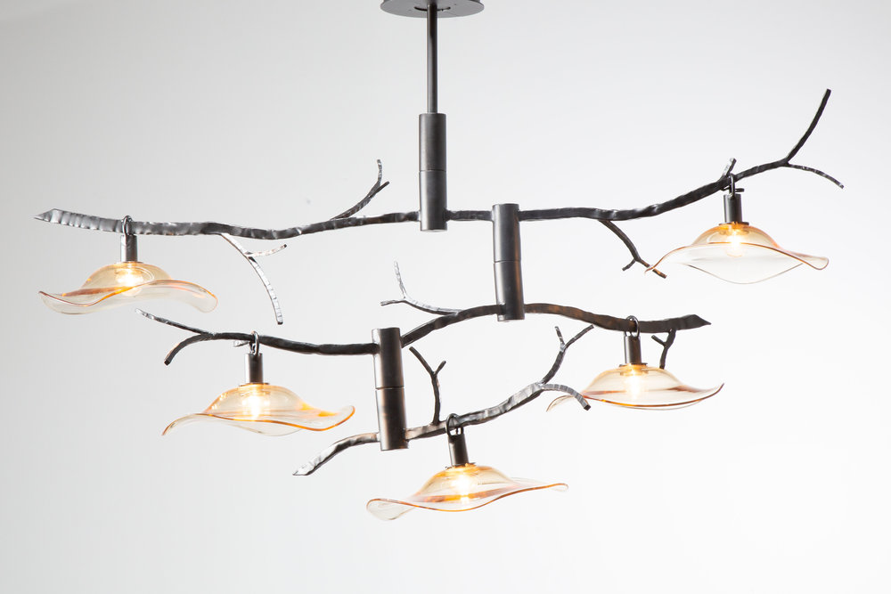
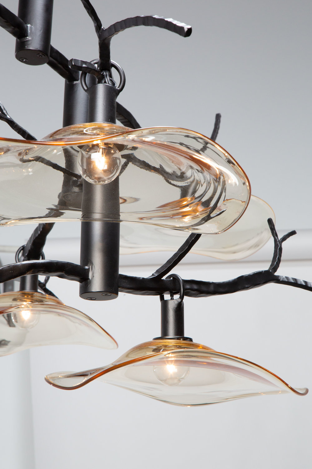
Similarly, in the custom dining light shown above and below, hammered metalwork quietly echoes the organic aesthetic of the undulant glass shade, lending an important element of harmony to this asymmetrical fixture design.
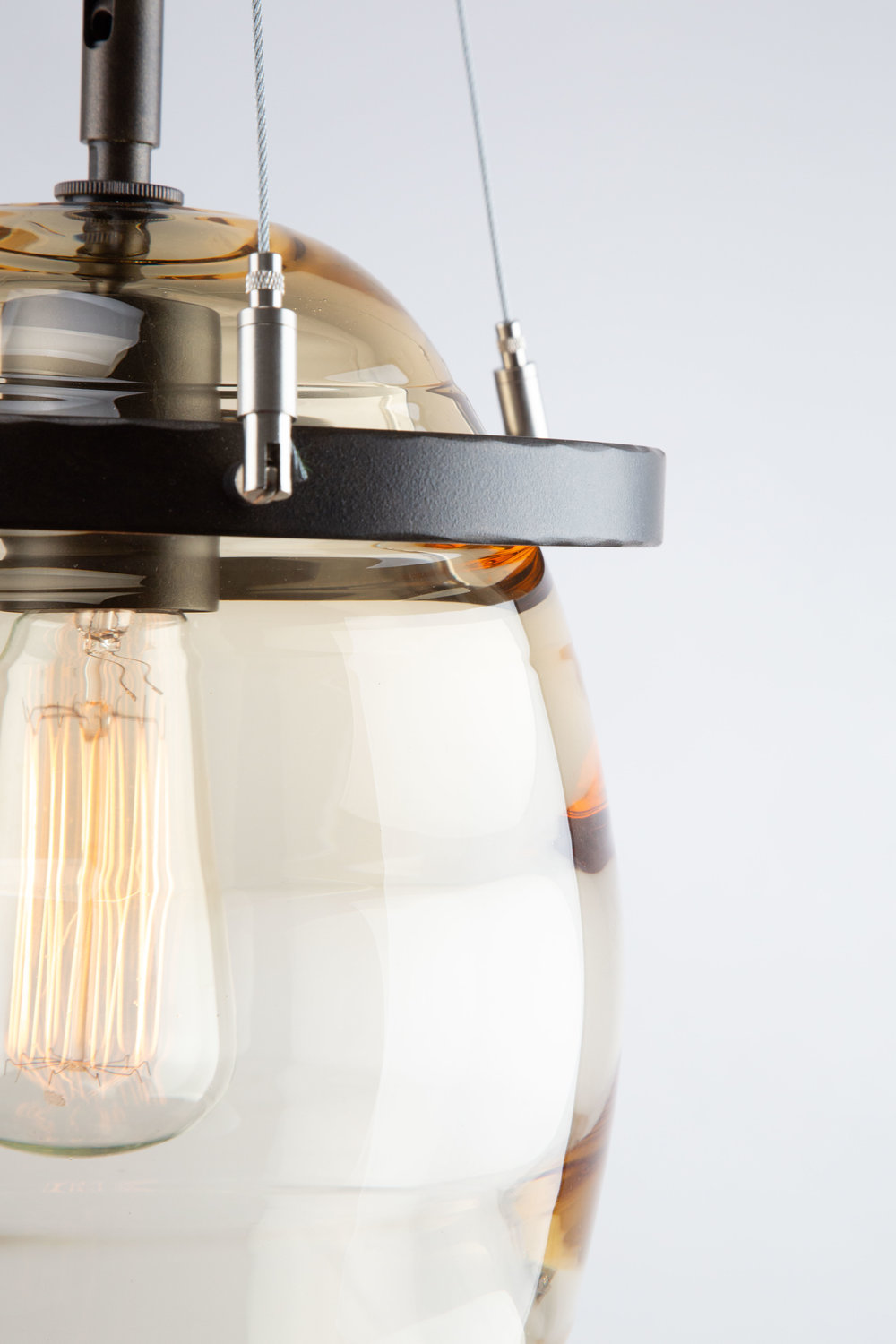
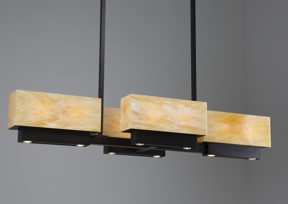
A high-contrast palette juxtaposing luminous amber-colored optic blown glass and matte black steel adds design edge to the modified LAA2013 pendant shown above.
See anything of interest? Contact your Hammerton representative for details on any of these recent custom designs, or to incorporate ‘bold gold’ contrast in your next lighting project.